
This is 21st century and as you know that it’s almost 2016. We have a lot of technologies that we use in our daily life such as Laptop, Smartphones, and many others. With mobile technology on the rise, we spend more time on our mobile devices. Reading news on the go, browsing interesting websites, or even doing our shopping online. We now do those tasks on our smartphones and tablets, where before we used our computers.
In fact, a report from comScore shows that 55 percent of all time spent on online shopping in June 2013 was on a mobile device. Also, in the same year, one-third of worldwide internet traffic came from mobile devices according to a marketing and publishing firm called Walker Sands Communications.
And if you are a small business website owner and making sure that your website is mobile-friendly. It’s such an extremely important task to know about. Did you know? 72% of the people want a mobile friendly website.
In this article I’m going to show you “how can you test if your website is mobile friendly”.
Let’s begin!
How to Check if Your WordPress Website is Mobile Friendly:
Before checking if your website is mobile friendly, you need to know exactly that how much traffic you are getting from mobile devices. The most simple way to do this is to use Google Analytics. All you have to do is just login to your Google analytics account and select corresponding web property for your website. In the left-hand side menu, click on Mobile and then Overview, you will be able to see that how much traffic you are getting from desktop, smartphones and also tablet.

If you are gettng confussed or curious about which device your visitors are using when browsing your wbsite. You can also get that information by clicking on “Devices” button.
Now that you know that how much traffic your website is getting, It’s time to see if your website is mobile friendly.
3 tools you can use to check if your WordPress website is mobile friendly.
-
Google Mobile Friendly Test:
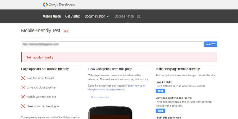
Google! I really like Google. It’s one of the best way to search about anything anywhere you want Google is very friendly not in just desktop it’s also friendly in smartphones also. So, The first tool is comes straight from Google and it’s very simple and straight forward to use. First of all open up your browser, go to Google Mobile Friendly Test, enter your website URL and click analyze, After a brief analysis. Google Mobile friendly test will show you the result, if the result comes up with the green message like “Awesombe! this page is mobile friendly”.
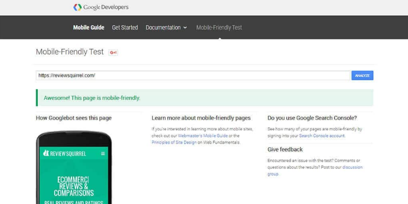
But, in case it’s not! the test will tell you your website is not mobile friendly. The test will also show you which errors are causing the problem, guide you towards helpful resources to make your website mobile friendly.
-
Screenfly:
The second tool Screenfly is slightly more strong, but, screenfly won’t give you suggestions on how to make your website mobile friendly, and also it won’t point out any errors, but screenfly will let you see how your website’s appears on various screen sizes, including smartphones, tablets and even TVs.
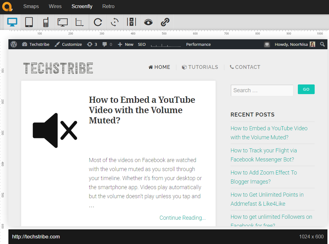
The usefulness of this tool comes from the fact that your website might have a responsive design, but there might still be elements on your website that don’t display as they should.
-
MobileTest.me:
The last tool is MobileTest.me. This tool allows you to pick a specific mobile device, After entering your website’s URL you can see how your website appears on that specific device.
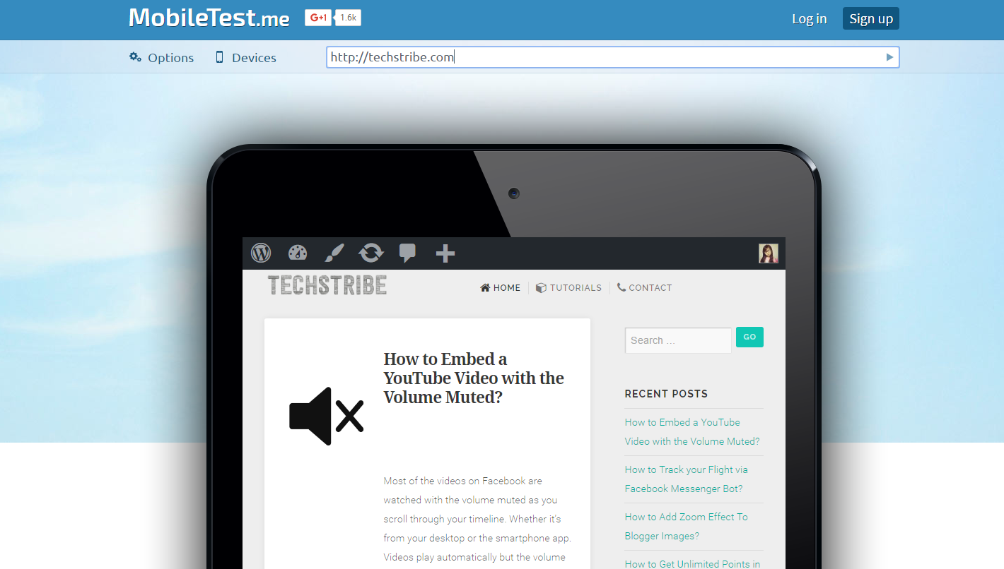
It’s a great tool to see how your website appears on any specific mobile device. This is a great way to see how your site works on mobile devices and to test some common elements like sharing buttons and sign up forms.
Enjoy 🙂

