Mobile Version unlike before, the world of web development has evolved to a stage where websites have different versions based on the device they’re being accessed with. For example, if I access Youtube on iPad, the version of the said website will be one for iPad. Your browser on iPad is instructed to specifically show the website in iPad version, rather than standard desktop version. This act of web design responding to devices of different sizes is called as responsive Mobile Version.
Now whether you’re testing to see how your website looks like an iPhone or just curious what that looks like an iPad, you can do so by changing user-agent. Although you can change user-agent manually without the need of any software, however, that’s not the way for non-technical users. There are browser extensions for Chrome and Firefox, which let you change your user-agent.
How to View Mobile Version of a Website on Desktop?
To try this, you will need to install either User-Agent Switcher for Chrome or User Agent Switcher for Firefox.
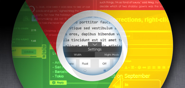
Once you’ve installed the extension, click its icon. To change user-agent for iPhone 6, go to iOS > iPhone 6. As shown here:

You may need to reload the page you’re currently on to see the changes. If, despite reloading page, you don’t see any changes, it’s possible that the page is not responsive (meaning not specifically designed for other devices). In the image above, this is the Google’s responsive version for iPhone 6. Now you don’t need an iPhone 6 to know what Youtube looks like in that device.
I might you to know about this one tip and coming soon I’ll share on TechsTribe 100+ Google chrome tips even hopefully, you got already but those are newly on TechsTribe.
I’m glad to write about the new topics.
Hope this tutorial helps.
Almost done!